What is a Color Match
The issue of what a color match is. It is merely a replication of a particular color with measureless precision, which is the root of the question. It is the art of making certain that the color formed on a medium is aesthetically identical to the target color. This is not an ordinary estimation with the eyes; it requires the process of quantifying the values of color so that there is uniformity. With professional printing, any successful match implies that the final production would meet the expectations and brand standards that the client or the customer would want to see.
Types of Color Matching
Color matching in professional printing uses different techniques depending on the complexity of the job, budget, and equipment.
Visual Color Matching
This is a conventional approach that is based on the trained eye of the press operator. The ink keys are manually counted by operators, depending on the color of the printed sheet against a standard.
Instrumental Color matching
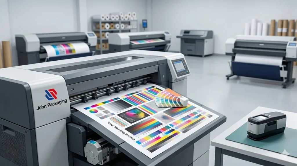
The device is an attachment to a spectral viewer, a device where samples are identified by color matching. The modern print houses employ a matching machine of color, like a spectrophotometer, to remove subjectivity.
Working Group Computerized Matching
Computerized programs have been used to calculate precise ratios of inks to minimize the apparent look of formulations on various substrates. This simplifies the matching of ink to suit individual colors that are not in the regular libraries, and this is done before printing.
Art vs. Process Matching Color Spot and Process
Spot color takes pre-mixed ink to achieve an excellent color-matched outcome, which is best when using logos. Process color mimics colors by applying the CMYK dots. More economical on images, process matching cannot be as colorful as spot colors.
Understanding Digital Color Models
One needs to learn how to master print reproduction, but firstly, he or she should know the digital settings where designs are created.
Define RGB.
The digital displays are based on the RGB model. It is applied on screens, such as predominantly monitors, televisions, and mobile devices, where it creates color in combination with red light and green light added to blue light. The reason behind this is that RGB is an additive; therefore, when combined with the three lights at the highest possible intensity, it will be white.
What is the CMYK Model?
The environment surrounding the CMYK model involves printing. This was a subtractive process of Cyan, Magenta, Yellow, and Key. The process that it would work by is screening light; the inks absorb part of the wavelengths and reflect the rest. When printing in colors on this model, you are to print on a set of clear inks to produce the effect of a complete spectrum.
The Difference Between CMYK and PMS
The next important distinction in the industry is the difference between CMYK and PMS. CMYK is a technique that uses pressurized dots for the size of comparatively small halftones to produce a wide gamut without being related to conventional and limiting printing techniques known as process colors. It is affordable with full-colored images, but it is limited in color.
The Pantone matching system, also known as PMS, employs exact shades by using specific inks that are pre-mixed. PMS colors, unlike CMYK, are not a combination of dots, but are solid since these colors are made of solid ink. This enables neon, metallic, or ultra-saturated colors that are not possible with conventional process printing.
The Process of Color Matching
Color matching is not only a technical process but also dependent on technology and the experience of human beings. It commences with the evaluation of the target color, whether a physical sample or an attack value. Print proliferators read the color data using a machine that detects color, typically a spectrophotometer. The device eliminates the human factor as it gives objective numerical figures.
They test a match of proof- a physical example that aims at imitating an ultimate output. This demonstration is used as the agreement between the printer and the client. Upon inquiry of a client, “Is this an accepted sample The operator makes use of both the spectrophotometer data and the visual observation in standard lighting to ensure that there is accuracy.
Material Considerations
The printing surface or substrate is the major determinant of the perception of color. The color and match accuracy association is influenced more by the material in use. The same ink will look enormous on a slick coated sheet of paper as compared to one that is uncoated and rough.
The absorbency of paper influences the way the ink will rest on the surface. Inks may seep on plain paper and spread, leading to dot gain and flattening out the picture. As such, the ink to match should take into consideration the substrate. The ink density or formulation may be increased or decreased depending on the texture of the paper, so that the end visual effect is the same regardless of the material used.
Finer Shades of Black and Grayscale
Though the majority of vibrant colors are the most popular, it is also hard to make the most suitable neutral. This routine could also be washed or dark brown in color. To get this rich black, printers often develop their own formulas for a color match to black that uses process black with an insignificant amount of cyan, magenta, or yellow.
In 4-color printing, one must make a close match to the shade to get a perfect black color. A picture can have an objectionable color implication when it is very out of balance in terms of the grey. The actual craftiness of the art of a press operator frequently lies in the use of the color matching the same in a grey or neutral composition. The real challenge of the skill of a press operator is oftentimes to make the colors adjust the same in a grey or neutral composition.
Importance and Limitations
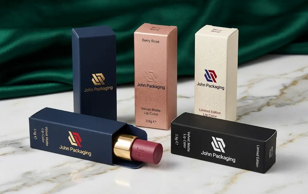
It is difficult to overestimate the importance of proper color matching. To global brands, color is a trademark. Any minor diversion will lead to the watering down of the brand and consumer confidence. Professionalism and quality are indicated by a matched output of color.
But what can be accomplished is limited. CMYK cannot reproduce all the colors in the RGB spectrum. This is known as “out of gamut.” Moreover, until calibrated, it is possible to have varied colors that are not intended to change. Other factors may make a certain color appear different under fluorescent light as compared to daylight-like lighting conditions.
Self-Proofing and Verification
Most of the designers proofread themselves, although commercial printers are used to proofread professional contracts. This will also be done by simulating the final output with the help of calibrated monitors and desktop printers. Although handy, self-proving is no replacement for a professionally made match proof on the real press paper. It is a screening mechanism to rectify key anomalies that might release a job to the press.
Conclusion
Finally, there is professional printing that constitutes predictability. It is linguistics or eliminating the guesswork of the equation. The digital design of the last scan of the press is all done in places that must be checked to make sure that the finished result is an accurate visualization of the creative intention. The industry has managed to provide high-fidelity results despite the use of technology, with a high degree of accuracy and competence that has been built in the hands of skilled operators.
It is a non-negotiable standard whether it comes to a brand whose logo should always be identical or making an ideal depth in a photograph. The capability to match the shade cannot be compromised. In today’s visual communication era, control of color recreation is the key to the quality of professional printing.
FAQs:
What is the importance of color matching for the brand?
Color is a trademark of global brands. Brand recognition and consumer trust are guaranteed by uniform color matching, and the issue of watering down the brand identity by variation in color is avoided.
What is the effect of the substrate material on color?
The substance influences the absorption and reflection of ink. Glossy coated paper gives colorful effects, whereas uncoated stock takes ink, which may lead to dot gain and make it dull.
What is the reason for the match proof?
A match proof is a material contract between the client and the printer; this represents an imitation of how the final printed object will ultimately look prior to the actual production run.
Why does getting a perfect match of black color not come easily?
Normal black process in the window may very well be pale or brown. Rich black Process black mixed with a little cyan, magenta, or yellow is desired by printers as it produces a rich black.
How is spot color matching differing in process color matching?
Spot color matching involves using preset colors with a mixture of precise colors that are of great interest in logos, whereas process color matching can replicate colors by using overlapping dots of the four primary CMYK inks.